What makes the most sense to me is the description of photos for the first-order messiness example in chapter 9. I too have my fair share of pictures stuffed in shoe boxes and drawers. I bought photo albums for my high school graduation party and attempted to fill some of them to put on display, but you can’t possibly put all of your pictures in photo albums because some just aren’t worthy enough, and nobody really wants to have thirty photo albums sitting around (although that reminds me of an episode of “Girls Next Door” where Hugh Hefner has a library of scrap books—nearly 2,000 of them spanning his lifetime).
I never thought of how the value of the pile of pictures goes down the more you add to it. Weinberger says “the more photos you add, the less likely you’re going to be able to find a particular photo, and the bigger the hurdle to making the pile usable” (175). Here's a commercial I recently saw that perfectly describes this.
Sometimes I have a hard time finding my digital photos on my computer too, although it's not as bad as the photos in the shoeboxes. I have hundreds of pictures that I have at least tried to organize by folders on my computer, but it’s still messy. Weinberger says that the more information, or metadata, is attached to each photo, the more potential it has regardless of how messy it may be. This is apparent in the example that is given with Flickr, where we can acknowledge that messiness is okay as long as you can find whatever it is you’re looking for, which makes me think about my house. Although my house is clean, it tends to be on the messy side--clothes may be all over the place, books lying around, etc. (not complaining, we've just always been a very busy family). If my Dad tries to “clean” things up though, my Mom gets angry because she can never find anything afterwards. Even though it is “messy,” my Mom still knows where everything is. And if my Dad puts things where they don’t “belong” then you could be stuck searching for that one shoe you left in the living room for months, like that one photo you just can’t seem to find in your overflowing shoe box of memories.
Tuesday, April 28, 2009
Tuesday, April 21, 2009
Oakland, The World, and the Divide: How We All Missed the Moment
I don’t know much about the issues of access regarding technology or the statistics other than the fact that some people are always at an advantage and others are always at a disadvantage. Coming from an all white, middle class school district, I can’t pretend to speak for African Americans and their struggles with the “Digital Divide.” However, I would like to argue that I believe it’s more than just a race issue, and that issues of class must also be recognized. Although Banks seemed to be primarily concerned with the race issue, he did mention how computers are distributed differently among races and socioeconomic status, which “contributes to the ongoing patterns of racism and the continuation of poverty.”
I’m not saying I’m naive about the fact that African Americans may not have equal access to technology. I just don’t feel comfortable discussing the issue without being completely informed about it, which is why I’d like to pay more attention to equal access for everybody. This was a topic that came up in my Composition of Theory course. We discussed how integrating computers into the classroom will set particular students apart from others and put them at a disadvantage. Since the language of computers is English, all other languages and their cultures are automatically seen as second-class status (Moran 215). Right away that contributes to alienating different races and/or cultures, “especially among families in poverty and families of color” (DeVoss 170). Now obviously it would be ideal for every school to have computers and teachers who were trained to teach with them, but I don’t think computers in schools is enough. Students who own computers are at an advantage over students who do not own them. When it comes to the issue of class, not all families can afford computers, so students from low-income families will not have the same privileges as students who do have a computer in their home.
Here are the two articles I cited from:
DeVoss, Danielle Nicole, et al. "Under the Radar of Composition Programs: Glimpsing the Future Through Case Studies of Literacy in Electronic Contexts." Composition Studies in the New Millennium: Rereading the Past, Rewriting the Future. Ed. Lynn Z Bloom, Donald A Daiker, and Edward M White. Carbondale: Southern Illinois UP, 2003. 157-173.
Moran, Charles. "Technology and the Teaching of Writing." A Guide to Composition Pedagogies. Ed. Gary Tate, Amy Rupiper, and Kurt Schick. New York: Oxford UP, 2001. 203-223.
Tuesday, April 14, 2009
Everything is Miscellaneous Ch. 7-8
I like the idea that knowledge is becoming more of a social act. I also like knowing that I can be regarded as an individual rather than the whole when it comes to my interests. I like miscellaneousness over men in a board room making decisions for me. Weinberger says, “Authorities have long filtered and organized information for us, protecting us from what isn’t worth our time and helping us find what we need to give our beliefs a sturdy foundation” (132). But what do these so-called authorities know about me? How do they know what I want filtered or what things I want to know? How can they possibly filter and organize information in a way that works for every single individual? Maybe it’s “comforting” knowing that somebody has taken the time to filter things that are useless, but maybe it’s also made us more skeptical. I certainly don’t believe everything I see or hear anymore. I have turned into somebody that questions everything. Is it because of something like wikipedia that has made me this way?
I don’t use wikipedia for any type of academic work, unless I am looking for the basic knowledge of an unknown “something” and just need a quick answer. But I never use wikipedia for more “important” things like research, because everyone knows that you can’t count on it being a credible source since you don’t know who the information is coming from. But in a way, I also think it’s reassuring that wikipedia posts notices like “the neutrality and factual accuracy of this article are disputed” (see page 140 for more). It allows me to go through the page with some ease, knowing that I don’t have to question whether it’s credible or not, because they’ve already come out and stated that it may not be.
This made me think of the in-class group assignment we did the other day. One group used the freevibe.com website, and it was pointed out that the information on the page wasn’t all factual, and we wondered where it was even coming from. We also noticed the “staging” of the pictures that were used, and the fact that the testimonials were clearly hand chosen (because a website against using drugs isn’t going to post anything that goes against their stance, like a post that says, “Drugs are fine. I’ve been using them for years and blah blah blah…you get my point”). And this goes back to the reading where Weinberger points out how newspaper stories are usually “presented as nothing less than rock solid,” and “letters to the editor [are] carefully selected by the editors” (141). What can we trust anymore? Who can we trust anymore? What are the proper ethics, and who has the authority to choose what and how much of something should be included?
On another note, I also liked the section on how social knowing changes who does the knowing and how. The description of students doing their homework while they have multiple instant messages going on, comparing answers, and asking for help on questions was pretty much describing me in high school (and from what I’ve seen on other students laptops in some of my classes, describes some students still today). But whereas standardized testing valued individual knowledge, this other type values social learning. I believe both are important, but clearly the latter is becoming more and more useful and relevant today. I’m a big fan of collaboration, or what Weinberger refers to as conversation. And if I like this type of learning, I suppose I like the idea of wikipedia and how it allows group knowledge to evolve (though there are still concerns obviously). But at least in this case, “what you learn isn’t prefiltered and approved, sitting on a shelf, waiting to be consumed” (146), although that type of learning still has value too.
Saturday, April 4, 2009
Understanding Comics (Ch. 6 Show and Tell)
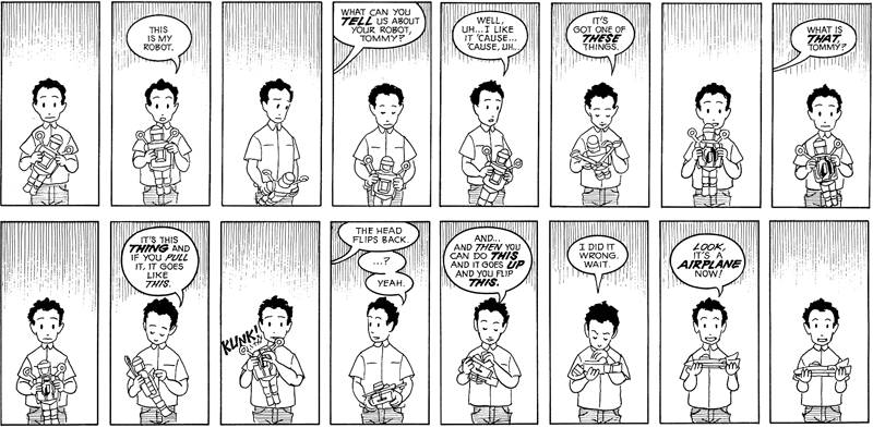
I found Scott McCloud’s chapter, “Show and Tell,” very interesting. I like that he started out with the young boy trying to describe his toy with words and not being able to really say what it was or how it worked. I’ve never been into reading comics, but I can appreciate their art of storytelling. Before reading this chapter, I assumed writing comics was simple. I didn’t realize that there are so many ways that words and pictures can work together. McCloud breaks up the different ways in to categories, which I find very helpful. I also liked his description of words and pictures acting like partners in a dance. He says, “Each one takes turns leading…when both partners try to lead, the competition can subvert the overall goals.”
To explain each category, I tried to find examples, or pictures, that would help illustrate my words. It was a lot harder finding an example of each than I thought it would be. Click on the pictures to make them larger.
1. Word specific: pictures illustrate but don’t significantly add to a largely complete text
I chose this comic because if you just looked at the pictures, you could come up with a different meaning than what you get from the text. After you read the text, though, the picture makes more sense.


To explain each category, I tried to find examples, or pictures, that would help illustrate my words. It was a lot harder finding an example of each than I thought it would be. Click on the pictures to make them larger.
1. Word specific: pictures illustrate but don’t significantly add to a largely
complete textI chose this comic because if you just looked at the pictures, you could come up with a different meaning than what you get from the text. After you read the text, though, the picture makes more sense.

This comic is all about the pictures. The words really are the "soundtrack" to the action taking place.

3. Duo-Specific: both words and pictures send essentially the same message
You could just look at the pictures and grasp the message (and vice versa).

4. Additive: words amplify or elaborate on an image or vice versa
In this comic, the words aren't even necessary. You can get the message by just looking at the picture. The words are extra.
5. Parallel: words and pictures seem to follow very different courses without intersec ting
ting
This was the hardest example for me to find. It may be a stretch. I chose it because the text and the pictures don't really make sense together. The text and the picture seem to be two different stories.

6. Montage: words are treated as integral parts of the picture
I couldn't find a comic example for this, but the picture works for the whole idea of words being used to make up the picture.
7. Interdependent: words and pictures go hand in hand to convey an idea that ne ither could convey alone
The text and the pictures work together nicely. In this case, the text says more than the picture, so the picture is allowed to be more free.
Monday, March 30, 2009
Everything is Miscellaneous Ch. 5-6
“The Laws of the Jungle” was all about tagging, which allows you to assign a name to any page, post, photo, video, etc. to help you remember things your way. I understand the importance of tagging with the amount of information we have readily available to us these days. And since there is so much information, it’s clearly difficult to keep track of it all and organize it in ways that work for everyone. While Krug applauded the use of tabs, similar to folders, Weinberger says that folders are a disadvantage because an item can only go in one place. Tags are metadata that describe an item or piece of information, which allows individuals to find that item or piece of information when browsing or searching. Since anyone can assign a tag, there are many opportunities to find what you’re looking for.
When reading this chapter, the first thing that came to mind was Patrick’s reading posts. When we first began our blogs at the beginning of the semester, I wasn’t aware of the concept of tagging, and I was confused as to why he had so many things highlighted in his text, and a long list of random words in a column down the side of his post. I thought maybe Blogger was the one doing it, but then I realized my posts weren’t automatically being randomly tagged too (or what Blogger calls “labeled”). Now I realize that he uses tags to give people further information on what he is talking about or referencing, and also to help people find what they’re looking for easier and faster (and also because he “loves tagging”).
At the end of the chapter Weinberger lists four principles regarding the way we organize physical objects and ideas.
- Filter on the way out, not on the way in (don’t assume something is of no value right away).
- Put each leaf on as many branches as possible (makes something easier to find, more usable, and more profitable).
- Everything is metadata and everything can be a label (metadata is what you already know and data is what you’re trying to find out, makes sites easier to use, everything is connected).
- Give up control (users are in control instead of the owners of the information).
Other than Patrick's blog, popular websites that use tagging include Flickr and Twitter.
Friday, March 13, 2009
Don't Make Me Think (94-185)
One point I found particularly interesting in the second half of Krug's Don't Make Me think was "Nothing beats a good tagline." It made me wonder if I ever even pay any attention to taglines. So I decided to take a look at some sites I frequently use, as well as some popular ones, to see what their taglines are. My first stop was facebook. Obviously it's one of the most popular sites going right now, so I figured its tagline would be something catchy, humorous, or maybe even quirky. This was not the case, however, and instead I was left disappointed. "Facebook helps you connect and share with the people in your life." Talk about boring (and maybe even a bit vague). My first thought was, "they couldn't come up with something better than that?"
So I went on with my search...
Youtube's "Broadcast yourself" is nice and short, and it certainly works, but maybe they could come up with something more creative. iTune's tagline is a bit generic: "The best place for Games, Movies, Music, and much more - All for iPod." The tagline for the Public Relations example I used for the first half of Krug's book is, "Advancing the Profession and the Professional." I like it, but it kind of blends in with the rest of the page. And one of my favorite taglines that I think is really charming is Kay Jewelers, "Every Kiss Begins with Kay."
Then I came across a neat website all about taglines. Eric Swartz, "The Tagline Guru," offers some more information on taglines, like what they are, their benefits and objectives, and different types of taglines. He also has a list of The 100 Most Influential Taglines Since 1948. Check them out, it's pretty interesting. Some of my favorites include:
- Got milk? (1993) --California Milk Processor Board
- Just do it. (1988) --Nike
- Tastes great, less filling. (1974) --Miller Lite
- Melts in your mouth, not in your hands. (1954) --M&M Candies
- There are some things that money can’t buy. For everything else there’s MasterCard. (1997) --MasterCard
- What happens here, stays here. (2002) --Las Vegas
- The quicker picker-upper. (1991) --Bounty
- Betcha can’t eat just one. (1981) --Lay’s Potato Chips
- Think outside the bun. (1998) --Taco Bell
- Don’t get mad. Get GLAD. (early 1980s) --GLAD
So basically some good things Krug says to keep in mind when coming up with a tagline are: clear, informative, just long enough, differentiation, clear benefit, personable, lively, and sometimes clever. Things to avoid include being vague and/or generic. It's also important to have your tagline placed where users expect to find it (below, above, or next to the site ID).
Another part of this reading that I enjoyed was "The Reservoir of Goodwill." I can't help but agree with Krug when he says, "The reservoir is limited, and if you treat users badly enough and exhaust it there's a good chance that they'll leave....they may not be as eager to use your site in the future, or they may think less of your organization" (163). I think this is so true. I hate to be asked irrelevant information, I don't want to search all over the place for something just to find it wasn't there in the first place, and I don't want to use a website that makes me feel stupid, confused, is unorganized or is unprofessional.
Sunday, March 8, 2009
Don't Make Me Think (1-93)
I think Steve Krug is successful at pointing out his principles because he explains them well, and also gives examples to show the reader exactly what he means. I find him credible because he clearly shows that he knows what he is talking about when he backs himself up. While I was reading, I was constantly saying "Oh yea, that's so true." Most of what he has to say really is commonsense, and he explains that anyone can understand web usability. In his Introduction he says, "It's not rocket surgery....Like a lot of common sense, though, it's not necessarily obvious until after someone's pointed it out to you" (5). And Krug is just the guy to point it out to us.
"Don't make me think." These four words seem simple, but they mean so much when it comes to designing a webpage. When I'm on a webpage, I don't want to have to do any unnecessary work. If a webpage makes me feel overwhelmed and/or frustrated, chances are I'm never going to use it again. Design can be simple and still be visually appealing. I'm even a fan of making something original or unique (which was one of my groups rules in our Good, Bad, Ugly assignment). But being creative doesn't mean doing something so outrageous or different that you confuse your audience. Standards and conventions are still important because people like to feel like they know what they're doing or they know where they are. You will end up alienating your audience if you ignore some of the vital conventions that Krug points out in chapter 3, "Conventions are your friends" and chapter 6, "Web navigation conventions."
Noise is another principle Krug discusses. When there's too much going on, it's easy to become overwhelmed. You waste time asking yourself where you should start first. I understand there are some webpage’s that have a lot of important information they need to get to their audience, but there are also ways to design and organize that information so it's user-friendly (you can make tabs or sections, you can space things out, you can introduce stories and have a link to read more instead of making the whole thing available, etc.) An organization that I think does a good and bad job at organizing its webpage is the Public Relations Society of America. This is one of those websites that has a ton of information, but it is relatively easy to navigate around. Some good things about the design include:
- Each "chunk" of information is broken up into clearly defined areas.
- No happy talk (that I have noticed anyway).
- No unnecessary instructions.
- Sections with sub-sections (you can click on just the section header for general information, or go to a sub-section if you have a more specific idea of what you're looking for).
- Site ID is located in the upper left corner, and is clickable to bring the user back to the Home page (and there's also a Home link that can be clicked).
- Search option for those who don't want to browse.
- Page names (although they could stand out a bit more).
- Good use of breadcrumbs. (Home > Awards > Individual Awards > PR Professional of the Year Award).
- Navigation box on the left hand side of the page.
Here are some negative aspects of the webpage that I've noticed:
- Could use a better visual hierarchy.
- Could be more obvious about what’s clickable.
- Could use a "you are here" indicator (maybe the section you're in could be highlighted or have some way of making it stand out once its clicked).
- It's a little noisy. Unless you know specifically what you're looking for, there's a lot going on and many things to click on--you might not know where to start.
Sunday, March 1, 2009
The Sticky Embrace of Beauty
I had a similar reaction to Wysocki's article as some of my classmates, being that it was a bit hard to follow. Something that I kept getting stuck on was the whole idea of beauty being a universal thing. I wanted to feel like what I think is beautiful is my own opinion that can be and is different from other people's opinions. And what some random person thinks is beautiful may be something I find disturbing, or even offensive. Why do we all have to think the same way? Don't we appreciate our differences? Don't we say it's good that everyone isn't the same? Our different looks, perspectives, opinions, thoughts, etc. are what make us so diverse, so I find it hard to believe that something like beauty can be applied universally.
This made me think of something that kept coming up in my comp theory class last semester. We discussed the idea of whether our writing is our own and the question of authorship. Some say that we don't own our ideas because what we write about has been written about before, and we get our ideas from the other things we've read and heard. But even though we know that, we still have a hard time accepting that our great story or interesting idea we came up with has already been done before. And just like how we want to believe our ideas and what we write belong to us, we want to believe what we see as beautiful is our own opinion, not what someone else decides for us. We like the idea of independence and freedom, or at least I do, which is why I think I didn't like being told that beauty is universal.
But on another note, there were some points that I found interesting in this article. The idea of visual hierarchy makes sense to me. Wysocki says, "visual arrangement makes easy one's access to what is most important in a layout, will sieve out what is unnecessary or not to the point, will streamline the direction and speed of one's sight to hone in on" (hopefully I quoted that right, but I took it from my notes and since I read the article in the library, my notes are all I have to go by). This made me think of William's discussions of business cards and how your eyes move around the information depending on the design of them (as in pg. 52 where your eyes wander off the card in the first example, and your eyes go back and forth between the bold type elements in the second example).
I also found Bang's principles interesting. Although I may not have thought about them specifically before, they make a lot of sense to me and offer a great perspective. They also make me wonder, though, if they are universal principles. What we (Americans) may think could be completely different in other cultures. Just like colors, words, phrases, gestures, etc. represent different things for us and for other cultures, these principles could be drastically different. We might see the upper half of a picture as a place of freedom and spirituality, but who's to say every other culture views it that way? Maybe pointed shapes are visually important in some other cultures because they stand for strength and battle, while rounded shapes are weak and troubling for them (compared to the fear we get from pointed shapes and the comfort and security we get from looking at rounded shapes)?
This might be a stretch, but the example I'm going to use is from Oprah. She had a show about beauty around the world, where women from different countries discussed what's considered beautiful in their countries. This reveals some major differences in beauty among cultures, which also denies the universal beauty idea.
Wednesday, February 11, 2009
The Non-Designer's Design Book...aka A Bunch of CRAP :)
After reading Williams' principles of design, I found myself thinking back to projects I created for past classes, as well as some other creative things I have made, and I have to admit I'm rather embarrassed. I am now aware that what I thought looked good at the time is completely wrong in so many ways. The first image that came to my mind was of a slide show I created last semester. I am mortified that I actually showed it in front of my class and used it for a presentation (I always wondered why I didn't get as good of a grade as I had expected). I was the type of designer that was afraid of leaving too much open space. I used way too many pictures that ended up being more distracting and overwhelming than useful. Instead of choosing colors that were pleasing to the eye or made sense for the content, I chose colors based on what I thought was pretty (bright, flashy, pink). The list of my problems goes on and on. This reading made me wish I could go back in time and fix all of my major design mistakes (I would post an example of my horrible slide show but I prefer to pretend it never existed).
What I really like about Williams is that she not only explains her basic principles of design well, but she also backs them up with plenty of examples to help the reader visualize what she means. I found that technique very helpful for me. She also makes it easy on us by having a memorable acronym that can be applied to any design. CRAP is pretty self explanatory and can be used as a mental checklist so that whenever you design something, you can easily make sure you cover the most important principles. I found it amazing how sometimes the smallest changes in design made the biggest difference. There were many great points made about design, but one thing that stood out to me the most was: Don't be afraid to make a bold statement (aka go big or go home).
But even though Williams says it's good to be bold, there is such thing as over-doing it. You never want any part of your design to be distracting and take away from what you're really trying to get across. Take this random website for example. The graphic is repeated in an annoying and excessive way, and the font style and color fail to contrast, making the text very difficult to read because everything blends in with the background.
Basically I could make a long list of design don'ts, but we all read the book so we already know what they are. Just take a look at this website I found and you will see everything you should NOT do.
Monday, February 2, 2009
Everything is Miscellaneous Ch.3-4
I think that we have come a long way since the Dewey Decimal System (just a side note, but I thought it was interesting that he was born in Adams Center, NY). The 3rd order of organization, like with Amazon, is great for someone like me who needs many choices and possibilities. Amazon works for me because I usually do not know exactly what it is I am looking for, and the website acts like my personal friend that guides me to wherever or whatever I want. The Potsdam Library's website is also helpful for me and something I use all of the time. I use it often when doing research for a class or particular paper because I can go to that one place and have many resources available to me at the same time. I can search for all sorts of things, books, articles, e-books, media sources, etc., and not only from my library, but libraries worldwide as well. I can also use the features to narrow or broaden my searches. It works when I know exactly what I am looking for, and it helps when I have a topic/subject in mind, but have no idea what there is out there that could be useful to me.
I am not very knowledgeable about the web, and I do not spend a lot of time just searching the Internet (therefore some of the examples I come up with may be new and exciting to me but old news to everyone else--I apologize in advance). But the "faceted classification system" seems like a convenient way of organizing things in order to find something because it makes the searching part easy and painless, and it allows you to find exactly what you need. While browsing the Everything is Miscellaneous blog, I came across a site called the Carrot2 Clustering Engine. The site's description says it "organizes your search results into topics. With an instant overview of what's available, you will quickly find what you're looking for." It looks similar to google, but when you type in whatever you are looking for, a tree visualization is presented alongside your search results. Although it is new to me, it seems like it works with the Amazon example discussed in the chapter we read. I would need to mess around on it for a while in order to talk about it more, but maybe it is something you could check out or something that could be useful to you.
I would also like to add that I just stumbled across another website to mention (now that I am doing more searching, or rather paying more attention to different types of sites for the purposes of this class). The website is new to me, but may not be to you. Anyways, it is called Searchme: Visual Search. It seems to work like any other search engine, but the sites are shown visually instead of just listed. By categorizing the web, the site's goal is for searchers to get to the ir results with the least amount of effort and in the fastest way. You can search whatever you want, and then click on certain icons that are on the site (that vary by what you are searching, for example, SUNY Potsdam icons are libraries, economics, history, colleges, etc.), and then you will be taken to whatever icon you clicked on but within your original search. So when I typed in SUNY Potsdam, I was able to see Potsdam's homepage. When I clicked on the soccer icon, I was taken to Potsdam's athletic page, when I clicked on libraries, I was then taken to Potsdam's library page, and so on. This site allows you to see what you are searching before you keep clicking back and forth on useless sites. I think this is a cool site because I have not seen anything like it before, and it is neat to see how visual design keeps impacting nearly everything.
Monday, January 26, 2009
Everything is Miscellaneous Ch. 1-2
I liked how David Weinberger’s first two chapters in Everything is Miscellaneous were written to capture a contemporary audience that can easily relate to what he had to say. He did not find it necessary to use big fancy words just so he could sound intelligent and gain credibility. He also did not drag out his ideas in as many ways possible. He got right to the point and used examples that could help his readers visualize the things he wanted to get across and why. He begins chapter one by bringing you in and showing you what he has to say instead of just telling you. Weinberger is straightforward with his scenarios on how people tend to prefer order over miscellaneousness, and he shows us this by pointing out the way we order things naturally, like when serving a meal, going through the mail, etc. He was able to get my attention by using examples like iTunes and Flickr.
I was especially able to relate with the talk of digital cameras and having thousands of pictures stored on your computer, as well as the differences between digital photos and print photos in albums (or in my case overflowing shoe boxes or dresser drawers—which absolutely drives me nuts). I realize that I do not take as many pictures now as I used to because the more pictures I have the more complicated and confusing organizing them seems to get, even on the computer. I like how after Weinberger used familiar examples that I could relate to, he then moved on to ones that I was not familiar with. Using those more familiar types of examples first gave me the chance to better comprehend the ones I was not unfamiliar with, such as the catalogers within the Library of Congress, Bettman’s second-order organization, and the digital order at Corbis.
I was especially able to relate with the talk of digital cameras and having thousands of pictures stored on your computer, as well as the differences between digital photos and print photos in albums (or in my case overflowing shoe boxes or dresser drawers—which absolutely drives me nuts). I realize that I do not take as many pictures now as I used to because the more pictures I have the more complicated and confusing organizing them seems to get, even on the computer. I like how after Weinberger used familiar examples that I could relate to, he then moved on to ones that I was not familiar with. Using those more familiar types of examples first gave me the chance to better comprehend the ones I was not unfamiliar with, such as the catalogers within the Library of Congress, Bettman’s second-order organization, and the digital order at Corbis.
Subscribe to:
Posts (Atom)